๐Ÿ‡ฌ๐Ÿ‡ง Limited Time โ€” UK Onlyยท๐ŸŽ“ Free Learning for 1 Monthยท๐Ÿค– Free AI Training Includedยท๐Ÿ“š 4,000+ Lessons ยท 35,000+ Quizzesยท๐Ÿ† GCSE Mocks ยท Olympiad Papersยทโšก Selected Students Only ยท Limited Placesยท๐ŸŽ Free Value Worth ยฃ2,000ยท๐Ÿ‡ฌ๐Ÿ‡ง Limited Time โ€” UK Onlyยท๐ŸŽ“ Free Learning for 1 Monthยท๐Ÿค– Free AI Training Includedยท๐Ÿ“š 4,000+ Lessons ยท 35,000+ Quizzesยท๐Ÿ† GCSE Mocks ยท Olympiad Papersยทโšก Selected Students Only ยท Limited Placesยท๐ŸŽ Free Value Worth ยฃ2,000ยท๐Ÿ‡ฌ๐Ÿ‡ง Limited Time โ€” UK Onlyยท๐ŸŽ“ Free Learning for 1 Monthยท๐Ÿค– Free AI Training Includedยท๐Ÿ“š 4,000+ Lessons ยท 35,000+ Quizzesยท๐Ÿ† GCSE Mocks ยท Olympiad Papersยทโšก Selected Students Only ยท Limited Placesยท๐ŸŽ Free Value Worth ยฃ2,000ยท
Back to AI Assistants Directory
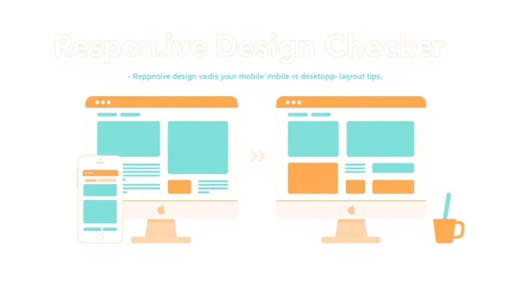
Responsive Design Checker โ€” AI study tool illustration
๐Ÿ’ป
Coding & Tech Assistant

Responsive Design Checker

Responsive Design Checker is your child's personal coding mentor inside Applaa. Whether they're writing their first "Hello World" or debugging a complex project, it gives clear, patient explanations and helps them become a confident, independent coder โ€” step by step.

yearYear 5Year 6Year 7Year 8Year 9Year 10Year 11Free foreverUK Curriculum
Applaa AI Assistant โ€” Live Preview Live
Why is my Python loop printing forever? ```python x = 1 while x < 5: print(x) ```
๐Ÿ‘จโ€๐Ÿ’ป
Ah, classic infinite loop! Look closely at your condition: `while x < 5`. Since `x` starts at `1`, it is smaller than `5`. Inside the loop, you print `x`, but **you never increase the value of `x`**, so it stays `1` forever and never stops! Here is the fix. Add `x += 1` at the bottom of your loop: ```python x = 1 while x < 5: print(x) x += 1 # This increases x by 1 each time! ``` Give it a try in Applaa's built-in playground!

How to use Responsive Design Checker

1

Open Applaa and select this tool from AI Assistants.

2

Paste your code, describe your error, or ask your coding question.

3

Get a clear explanation and fix โ€” then try it yourself to truly understand.

What you can do with Responsive Design Checker

Mobile vs Desktop layout tips. Here are some of the most popular ways students use Responsive Design Checker every day:

  • Makes coding concepts genuinely clear for beginners
  • Debugs errors patiently, step by step
  • Builds real skills valuable for school, uni, and careers
  • Ask unlimited follow-up questions โ€” the AI never loses patience or gives up on you
  • Works alongside any textbook, worksheet, or school resource

Responsive design means a website looks great and works perfectly whether you're viewing it on a mobile phone, a tablet, or a desktop computer. In today's world, most internet traffic comes from mobile devices, so responsive design isn't optional โ€” it's essential. The Responsive Design Checker helps you understand how layouts adapt to different screen sizes, why certain design choices work on mobile but not desktop, and how professional developers test across devices. This is crucial knowledge for anyone learning web design, graphic design, or front-end development. Whether you're building a website for a school project, considering a career in design or development, or simply curious how your favourite apps look perfect on any device, Applaa's tool shows you the principles and practices that make responsive design work โ€” no heavy technical knowledge required.

60%+
of web traffic now comes from mobile devices
3
main breakpoints to design for: mobile, tablet, desktop
100%
modern websites use responsive design

How to use the Responsive Design Checker effectively

The Responsive Design Checker works by showing you how the same website or design looks at different screen sizes. You'll see a desktop view (wide screen), tablet view (medium screen), and mobile view (narrow screen). The checker highlights what works well at each size: on mobile, navigation might collapse into a menu button to save space; images might scale down proportionally; text might reflow to fit the narrower screen. You can interact with these different views, understanding design decisions: why did this element move? Why did the layout change? How did the designer make it work for both tiny mobile screens and large desktop monitors? This visual exploration teaches responsive design principles far better than reading definitions.

  • Explore how professional websites adapt to different screen sizes โ€” compare a site's desktop, tablet, and mobile versions to see patterns
  • Understand mobile-first thinking: start designing for narrow mobile screens (the hardest constraint), then add more features for larger screens
  • Learn key responsive techniques: flexible layouts (using percentage widths instead of fixed pixels), scalable images (images that resize proportionally), and media queries (CSS rules that apply only on certain screen sizes)
  • Notice navigation changes: desktop might have a full horizontal menu, while mobile collapses it into a hamburger menu โ€” this saves precious mobile screen space
  • Observe typography changes: fonts and sizes might be larger on desktop for readability on larger screens, smaller on mobile for fitting more content
  • Test your own ideas: think about a website you'd design and use the checker to see how different layout approaches would work on mobile, tablet, and desktop

Common responsive design mistakes

The most common mistake is designing for desktop first, then squeezing everything to fit on mobile โ€” this usually results in a broken, unusable mobile experience. Students often use fixed pixel widths (width: 1000px) instead of flexible percentages, meaning the layout breaks on any screen narrower than expected. Another error is not testing on actual devices โ€” what looks fine in a desktop browser window resized to mobile width behaves differently on an actual phone with different processors, screen densities, and input methods. Images are often a problem: a 3000-pixel-wide desktop image doesn't need to be sent to mobile phones โ€” it wastes bandwidth and time loading. Understanding these mistakes helps you design sites that work well for everyone, not just yourself on your device.

  • Don't design desktop-first and scale down โ€” design for mobile first (toughest constraint), then enhance for larger screens
  • Avoid fixed pixel widths โ€” use percentages or flexible units (flex, grid) so layouts adapt to different screen sizes
  • Don't assume your desktop browser resized to mobile width behaves the same as an actual phone โ€” test on real devices when possible
  • Be careful with images โ€” don't send a 3000-pixel desktop image to mobile users who see it at 400 pixels. Use responsive image techniques
  • Avoid cluttering mobile screens: mobile users see less content at once, so prioritise ruthlessly โ€” what's truly essential?
  • Watch out for touch-vs-click differences: buttons need to be larger on mobile (thumb-sized), links work differently on touch devices than mouse clicks

Getting started

Your 4-step responsive design plan

Step 1

Step 1: Download Applaa free and open the Responsive Design Checker from Coding & Tech โ€” explore how 3 of your favourite websites look on mobile, tablet, and desktop

Step 2

Step 2: Notice and list responsive patterns you see: where does navigation move? When do layouts change? How do images scale?

Step 3

Step 3: Design a simple website on paper (sketch it out) for a mobile screen, then think about how it would look on tablet and desktop

Step 4

Step 4: If you're learning HTML/CSS, build a simple responsive page using flexbox or grid, then use the checker to test it on different screen sizes

1 month free, then 50% off for 3 months โ€” ยฃ4.99/mo

While Other Kids Get an AI Head Start, Is Yours Falling Behind?

Give your child the same AI app-building, exam prep and tutoring edge โ€” free for the first month, no credit card needed.

Join 10,000+ students building their first AI-powered apps with Applaa

Frequently asked questions about Responsive Design Checker

Is responsive design taught in GCSE or A-Level Computer Science?

GCSE covers web design principles, including responsive design in some specifications. A-Level goes deeper into web technologies. However, responsive design is more important in real-world web development than in exams โ€” it's a professional skill you'll use constantly.

If I'm designing only for mobile, do I need to think about responsive design?

Even mobile-focused designs should consider different phone sizes: tiny 5-inch phones, regular 6-inch phones, large 7-inch phones. What looks good on your phone might look broken on someone else's. Responsive design isn't just desktop-to-mobile, it's all screen sizes.

What's the difference between responsive design and mobile apps?

Responsive design is a web development technique โ€” one website that adapts to any screen. Mobile apps are separate software built specifically for phones. Responsive websites work anywhere without downloading anything; apps offer more control and offline features. Both have their place.

How do I test responsive design without fancy tools?

Most web browsers (Chrome, Firefox, Safari) have built-in developer tools with a 'responsive design mode' that lets you resize the browser to simulate different devices. It's not perfect (real phones behave differently), but it's a good starting point. The Responsive Design Checker shows professional approaches to testing.

Get Responsive Design Checker free

Responsive Design Checker and 500+ other safe AI assistants are available free inside the Applaa desktop app.

Windows 10+ ยท macOS 12+ ยท UK National Curriculum aligned

Why Parents Choose Applaa

  • 100% free โ€” no subscription ever
  • Aligned to the UK National Curriculum
  • Works for KS1 through A-Level
  • No ads, no data selling, no distractions
  • Kid-safe, COPPA-compliant, UK GDPR

Ready for Exam Prep?

Explore GCSE, 11+, A-Level, and Olympiad revision modules in the Applaa Learning Hub.

Go to Learning Hub